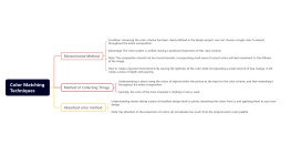
Color matching basics
2024-09-14 11:53:18 172 0 Report 0
0

Login to view full content
This mind map serves as a comprehensive guide to 'Color Matching Basics,' providing a detailed exploration of how colors interact and influence human perception. It delves into the fundamentals of color understanding, discussing the rational and psychological reactions to different colors. Key color properties such as hue, saturation, and brightness are highlighted, along with the distinctions between RGB and CMYK color modes. The map also examines color temperature, gender preferences, and industry-specific color usage. Additionally, it outlines various color scheme methods and offers a general workflow for effective color matching, emphasizing the importance of a clear and identifiable color scheme.
Other creations by the author
Outline/Content
Color Understanding
Rationality: The wavelength of light reflected by an object and its reaction in the human eye.
Sensibility: Humans have different psychological reactions to different colors.
Color properties
Hue: The type of color, such as red, green, blue
Purity (Saturation): The sensation of the intensity of a color
Brightness: the degree of lightness, the quantity of reflected light
Color Mode
RGB mode
The principle of display imaging, the more colors added, the brighter it becomes.
CMYK mode
The principle of printing imaging, the more it's described, the darker the color becomes.
Color Temperature
Cold colors
Cold colors, mainly blue, purple, and white. Think of winter, what colors do they usually present?
Warm colors
Warm colors, mainly yellow, orange, and red. Think of the colors of fire, the colors of the sun.
Color Gender
Male
Mostly use colors of very low purity, even black and white.
Women
They are usually soft and warm colors, such as pink, light blue, light purple, etc., which can create a cozy and romantic atmosphere.
Children
Children need strong hues to recognize colors. Children's understanding of color may only be in terms of hue differences, unable to distinguish between brightness and purity. Therefore, designs targeted at children should use bright colors as much as possible and employ full-hue designs.
Color industry attribute
The color with the highest probability of use during the industry development process
Technology companies generally use a calm shade of blue; the health and wellness industry typically employs green; the food industry generally opts for colors with high saturation.
Color scheme method
Complementary colors
The keyword is "complement," which refers to colors that are directly opposite each other on the color wheel, 180 degrees apart. For example, yellow and purple, green and red.
Complementary colors
Keywords: Luxurious, colors on the color wheel that are 120 degrees apart, such as yellow and red, green and blue.
Adjacent colors
Keywords: Steadiness, colors on the color wheel that are 90 degrees apart. For example, yellow and green.
Analogous colors
Keywords: Unity, colors on the color wheel that form a 60-degree angle. For example, orange and yellow.
Three Roles
The colors opposite the vertices of an equilateral triangle on the color wheel, such as yellow, blue, and red.
Four Angles (Full Color Range)
The colors corresponding to the four corners of the square on the color wheel.
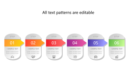
Color matching general workflow
Confirm the primary color and its shades
Based on VI, logo, industry attributes, audience attributes...
Confirm auxiliary color
According to VI, logo, main color, and the set atmosphere
Set the color area
According to the set atmosphere
Constantly modify and adjust
The key points of a color scheme: The color of the page should be identifiable at first glance
0 Comments
Next page
Recommended for you
More