Multi-dimensional comparison radar chart
2025-01-08 18:13:21 149 1 Report 0
0

Login to view full content
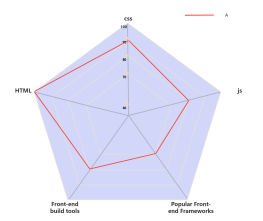
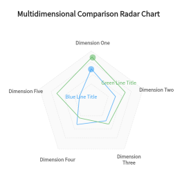
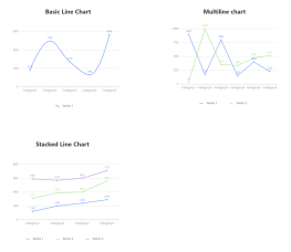
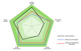
This is a multi-dimensional comparison radar chart, designed to visually represent and compare multiple dimensions simultaneously. The chart includes six dimensions, each with a specified maximum value, ranging from Dimension One to Dimension Six. The yellow and blue lines indicate different data sets or scenarios for comparison. This chart serves as a tool for explaining and introducing complex multi-dimensional data in a clear and concise manner, allowing for easy identification of strengths and weaknesses across various dimensions. It is an effective visual aid for analysis and decision-making.
Other creations by the author
Outline/Content
maximum value
17
Dimension Six
Yellow Line Title
0
Multi-dimensional explanation and introduction
20
Dimension one
Dimension two
18
15
10
Multidimensional Comparative Radar Chart
5
Dimension Three
Dimension Four
Dimension Five
Blue Line Title

Collect
Collect
0 Comments
Next page
Recommended for you
More