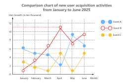
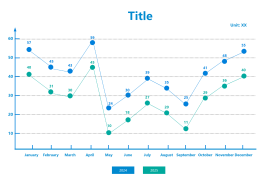
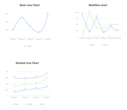
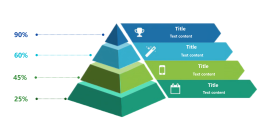
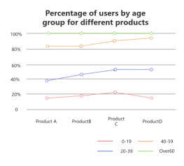
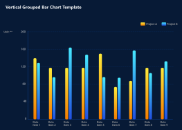
Sector chart, pie chart, percentage chart template
2025-01-08 18:13:21 130 0 Report 0
0

Login to view full content
This is a sector chart, pie chart, and percentage chart template designed to visually represent data distribution across three segments. The chart is divided into three parts: the largest portion at 50%, followed by 35%, and the smallest at 15%. Each section allows for a title and text content to be added, providing a clear and concise way to present information. This template is ideal for illustrating proportions in reports, presentations, or any scenario where a visual representation of data is beneficial.
Other creations by the author
Outline/Content
50%
Add the title here
35%
Add a title here
Add text content here
15%
Collect

Collect
0 Comments
Next page