Comparison charts transform abstract data into easy-to-understand visual language through carefully designed elements such as color, length, and area, allowing the audience to quickly capture key information and make more accurate judgments and decisions. This article will explore the concept, types, and drawing tutorials of comparison charts , and share multiple comparison chart templates, hoping to help readers master this tool , whether in academic reports, business analysis, or personal projects .
Comparison charts , as a basic and powerful tool in the field of data visualization, are used to visually display the differences, similarities or change trends between two or more data sets in a graphical way. This visualization method not only simplifies the interpretation process of complex data, but also greatly enhances the efficiency and persuasiveness of data communication.
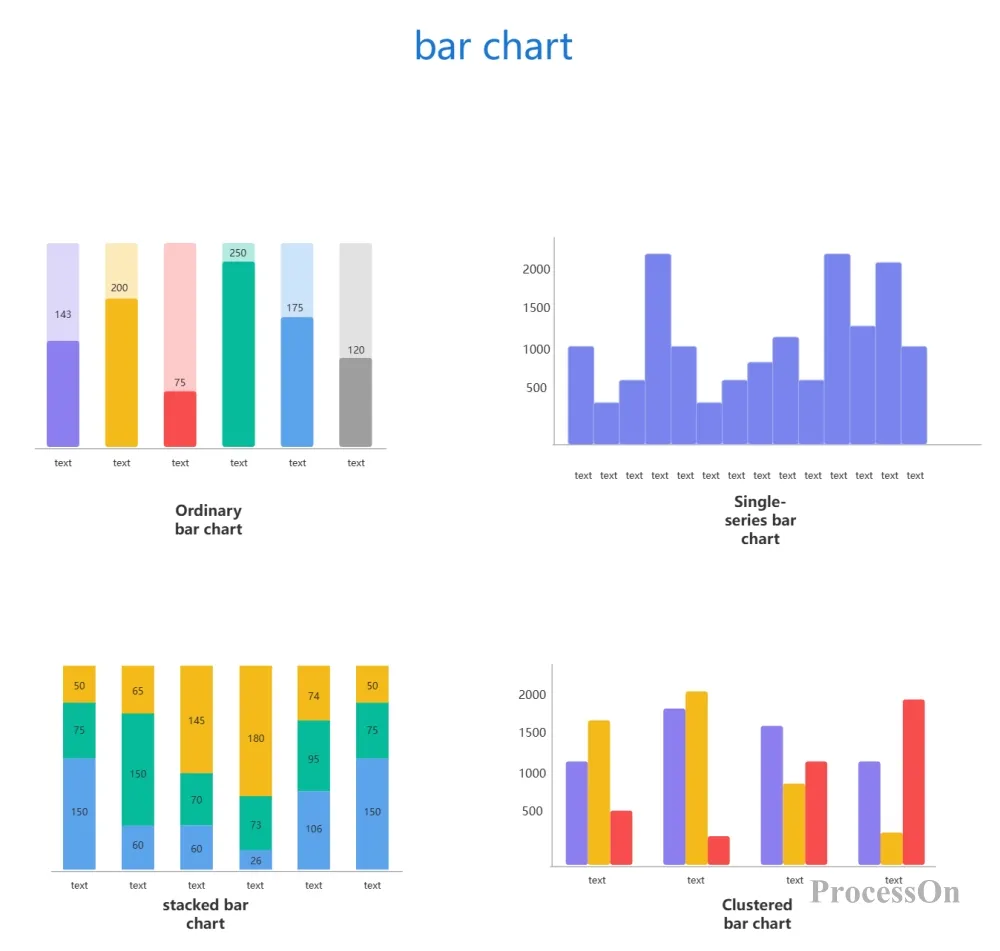
Features: It is most suitable for showing the comparison of quantities between different categories, and can intuitively show the difference in data through columns of different heights.
Applicable scenarios: sales data comparison, market share analysis, test score comparison, etc.
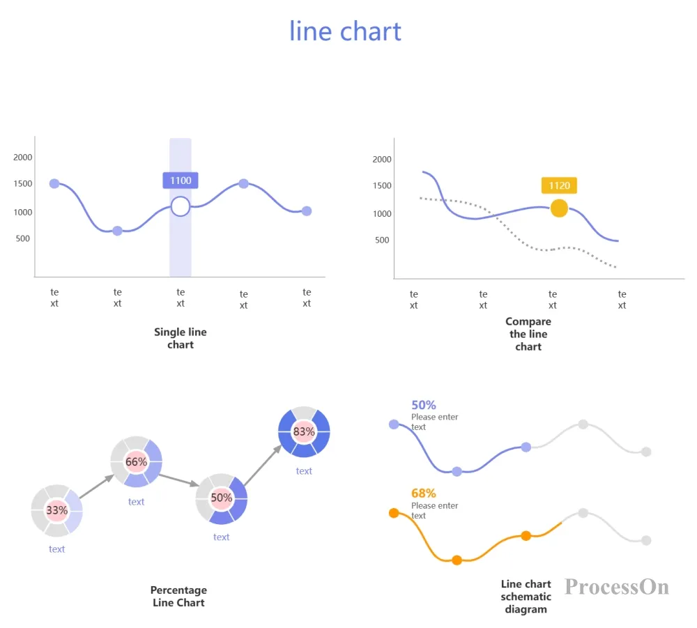
Features: Good at depicting the changing trend of data over time or other continuous variables, and showing the changes in data through the ups and downs of connecting lines.
Applicable scenarios: stock price trends, temperature changes, project progress tracking, etc.
Features: Used to show the proportion of each part to the whole, and to indicate the proportion of each part through fan-shaped areas of different sizes.
Applicable scenarios: market share distribution, budget allocation, user composition analysis, etc.
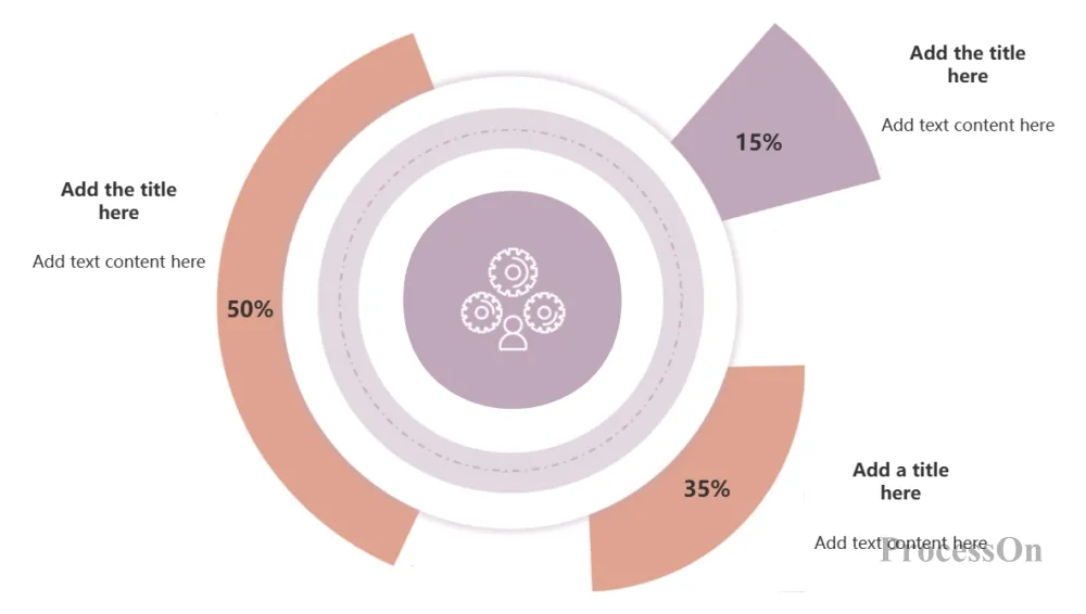
Sector chart, pie chart, percentage chart template
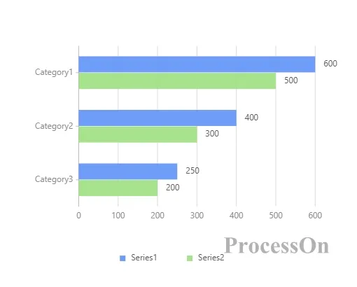
Features: Similar to a bar chart, but more suitable for displaying data with long labels or that requires horizontal comparison, by displaying data through bars of different lengths.
Applicable scenarios: product category comparison, regional sales data, customer satisfaction survey, etc.
Features: Used for multi-dimensional data comparison, showing the balance of data through axes radiating from the center and polygons connecting each data point.
Applicable scenarios: employee performance evaluation, product feature comparison, service quality evaluation, etc.
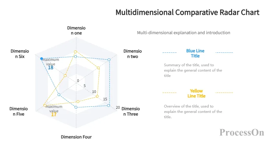
Multi-dimensional comparison radar chart
1. Data Series
The data series is the core of the comparison chart , which represents the data set to be compared in the chart. In a comparison chart , there are usually two or more data series, each of which is represented by a specific graphic element (such as a bar, line, fan, etc.). The data series can show the data changes at different time points, or the data comparison between different categories.
2. legend
The legend is the part of the chart that explains the meaning of different data series. In a comparison chart , each data series usually has a corresponding legend item, which distinguishes different data series through graphic elements such as color, shape or line. By viewing the legend, the audience can quickly understand the meaning of each data series and better understand the information conveyed by the chart.
3. Title and Tags
Titles and labels are the text parts of a comparison chart that explain the content of the chart and the meaning of the data. Titles are usually located above or below the chart and are used to summarize the theme and purpose of the chart. Labels are used to explain the various parts and data points in the chart, including axis labels, data series labels, and data point annotations. These labels help the audience better understand the data and information displayed in the chart.
4. Coordinate Axes
The coordinate axis is not a necessary element for all comparison charts, but it is a necessary element for some comparison charts, such as bar charts, line charts, etc. It is used to define the measurement standard and direction of the data series . There are usually two coordinate axes: the horizontal axis (X axis) and the vertical axis (Y axis). The horizontal axis is usually used to represent time, category or other continuous variables, while the vertical axis is used to represent the numerical value of the data. The scale, label and unit of the coordinate axis need to be appropriately set according to the nature of the data and the purpose of comparison.
Choose the right drawing tool based on personal preference, data size, chart complexity, and other factors. Spreadsheet software such as Excel and Google Sheets are suitable for drawing charts quickly; drawing tools such as Lucidchart, Canva, and ProcessOn are suitable for making simple charts or charts with higher layout freedom; business intelligence tools such as Tableau and Power BI are suitable for processing large-scale data.
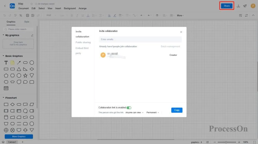
Here we mainly explain how to use ProcessOn to make comparison charts. ProcessOn is a professional drawing tool that can make comparison charts, flow charts, UML diagrams and other professional graphics online, and supports sharing and collaboration, and multiple people can edit online at the same time.
1. Open ProcessOn official website, go to the personal file page, and click Create to create a flowchart. Or go to the template creation page, search for " comparison chart " or "line chart" or "bar chart" and other specific comparison chart categories to select the template you need.
2. Click [More Graphics] in the lower left corner of the graphics library, find the chart category, and click [OK]. Drag the chart graphic in the graphics library on the left side of the maker to the canvas, double-click the chart to expand the edit bar on the right, and you can set the chart coordinate title and fill in the data.
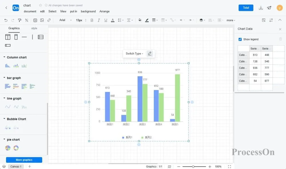
3. If the existing comparison chart system templates cannot meet your needs, you can also directly use the graphics in the graphics library on the right to freely draw a comparison chart and set a personalized layout and style.
4. Check the data, labels, styles, etc. in the chart to ensure that the chart can accurately convey information. After drawing, export the chart to common formats (such as PNG, JPEG, PDF, etc.) to facilitate embedding into reports, PPT and other documents to share with others . You can also share the comparison chart directly with colleagues or customers for them to view or edit online.
The ProcessOn template community contains a variety of comparison chart templates for reference in multiple industries, and supports cloning to improve drawing efficiency. The following are some templates for sharing.
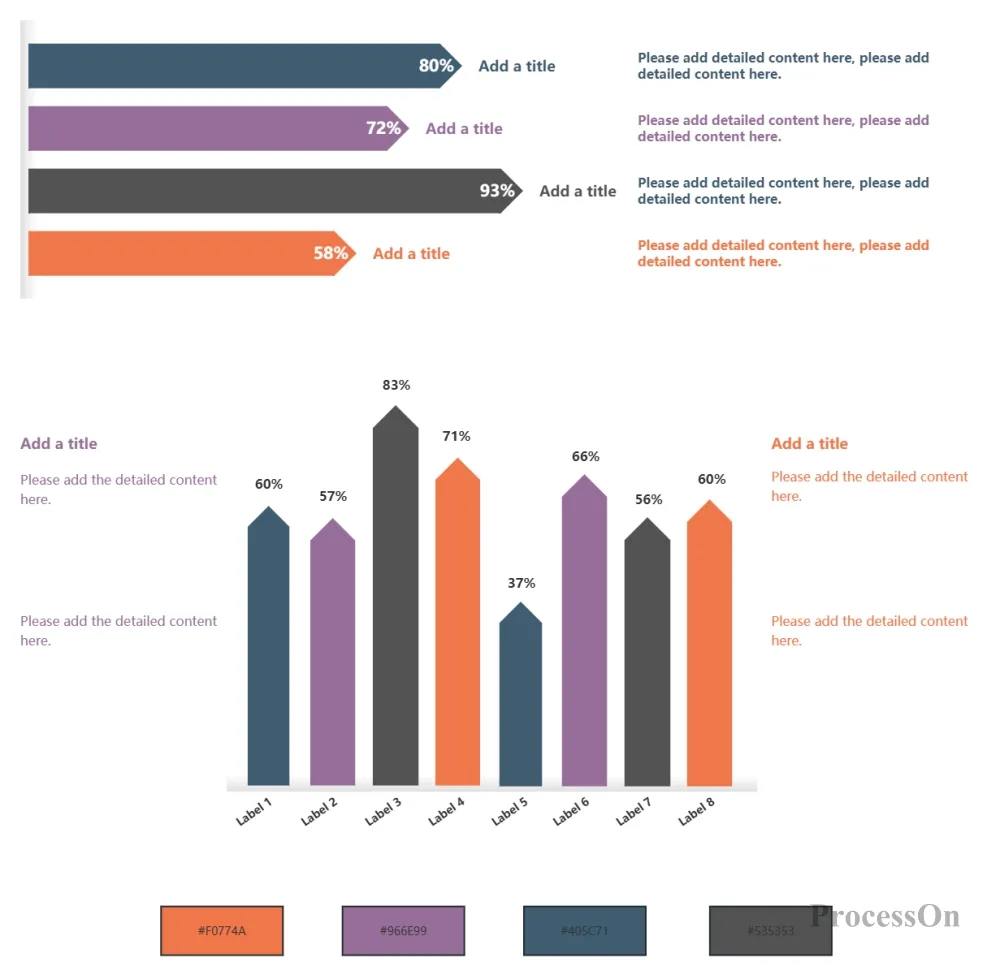
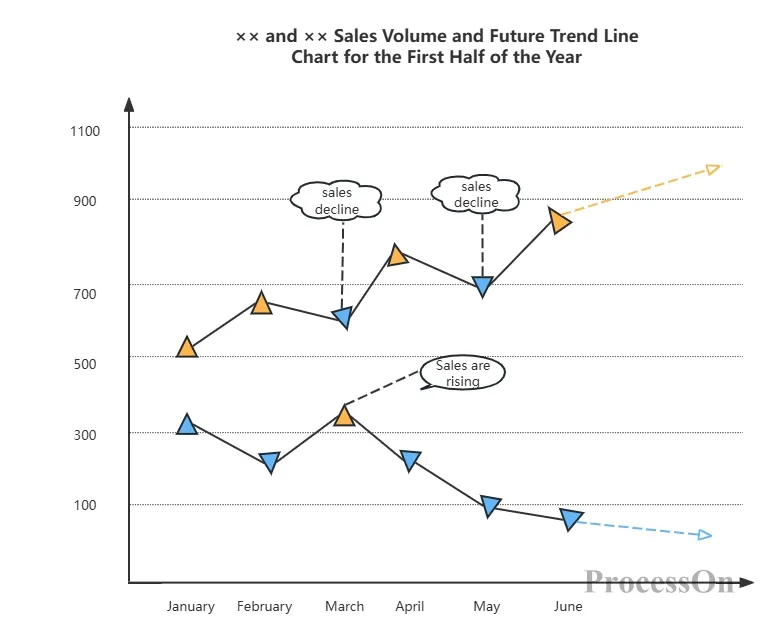
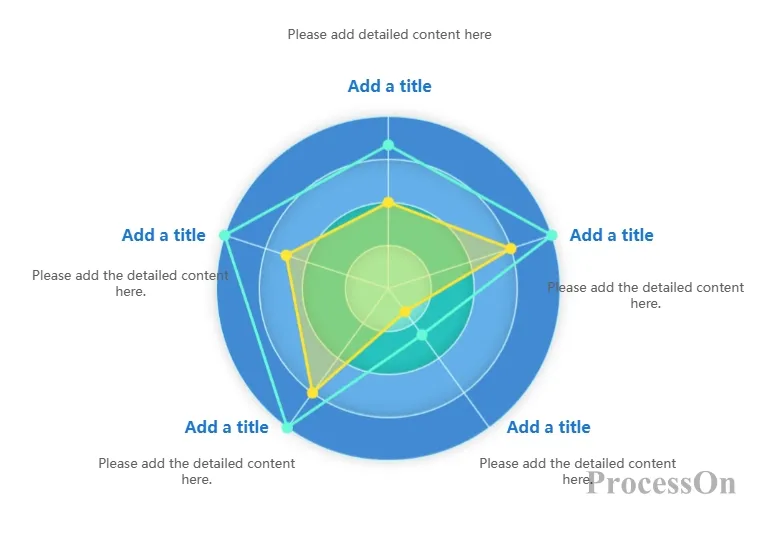
Comparison charts are an important tool for efficiently displaying data comparisons and trend changes. I believe that through the above sharing of comparison chart content, you have already mastered the wide application and value of various comparison charts in daily work and life.