Free distribution
Parenthesis Diagram
In data visualization and information communication, the pyramid chart is a very effective tool. It displays information through a hierarchical structure, helping people quickly understand complex concepts or data distribution. This article will comprehensively introduce this powerful visualization tool through the concept, examples , drawing methods , templates, etc. of the pyramid chart .
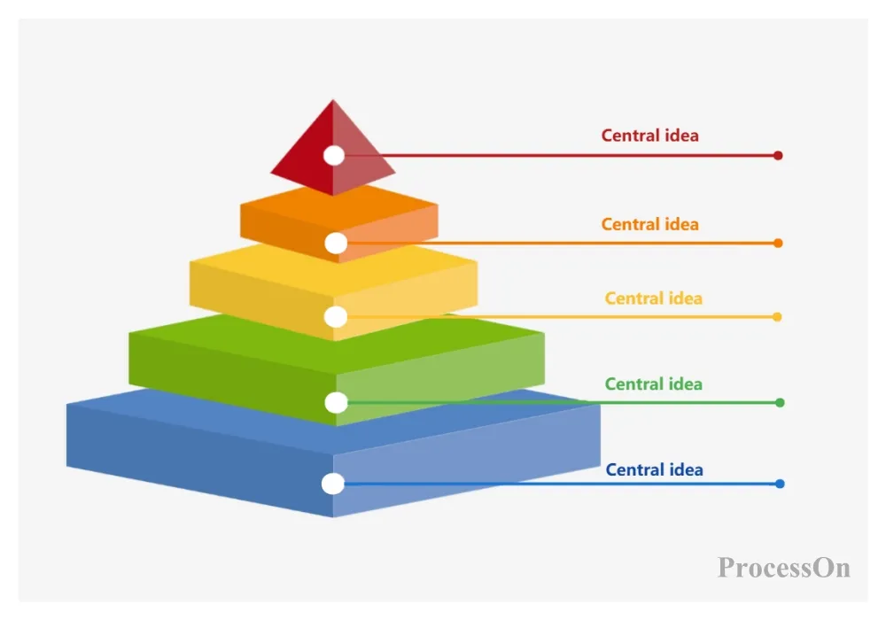
A pyramid chart is a chart that shows the relationship of proportions. It divides the proportion relationship by comparing the height of each block in the chart. It is named because it looks like a pyramid. The horizontal lines inside divide the height of the pyramid into trapezoidal and triangular blocks of different sizes according to different numerical values. The higher the block height, the greater the proportion, and blocks of different colors represent different classification variables.
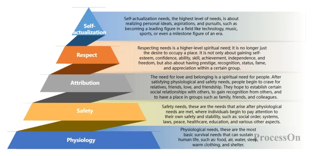
Maslow's need theory was proposed by American psychologist Abraham Maslow in 1943. The theory divides human needs into five levels from basic to advanced: physiological needs, safety needs, social needs, respect needs and self-actualization needs. In order to intuitively represent the relationship between these five levels, Maslow used a pyramid diagram, in which physiological needs are at the bottom of the pyramid, indicating that they are the most basic needs, and self-actualization needs are at the top of the pyramid, indicating that they are the highest level of needs.
It is an intuitive and systematic framework for understanding and optimizing one's energy state. The model is divided into four levels from basic to advanced: physical energy, emotion, attention and sense of meaning.
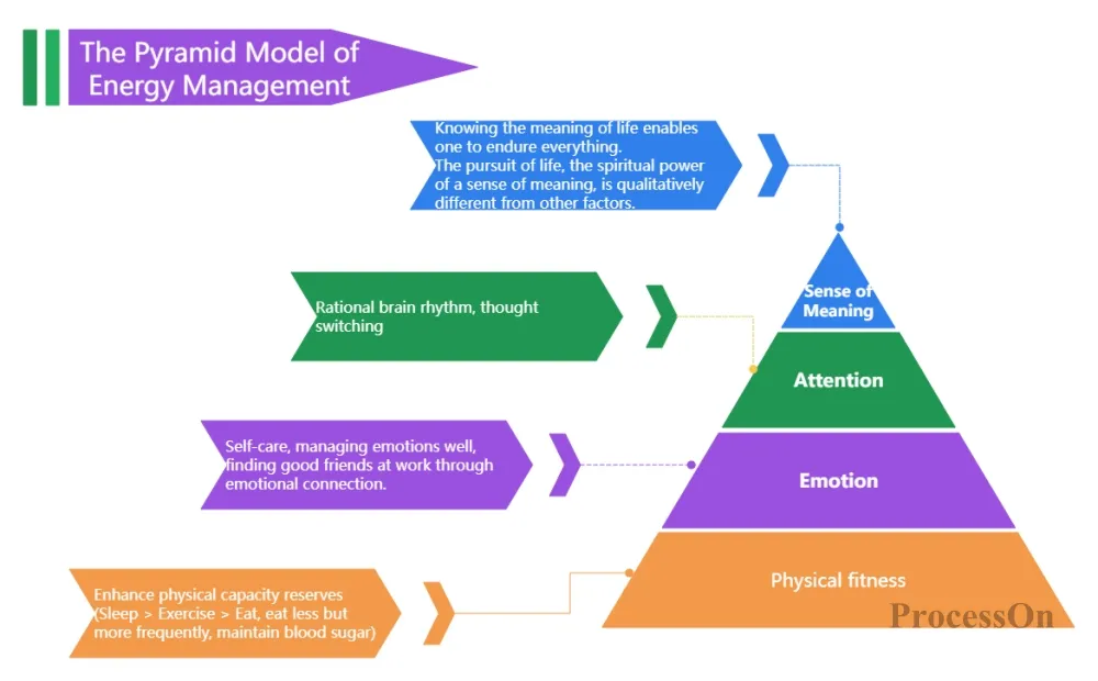
The pyramid model of energy management
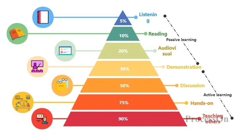
The learning pyramid is a theoretical model proposed by American scholar and famous learning expert Edgar Dale in 1946 to describe the different levels of human knowledge learning process. The model divides learning into two major categories: passive learning and active learning, and further subdivides it into five levels: listening, reading, audio-visual, demonstration and practice. By gradually upgrading different learning methods, people can master and apply the knowledge they have learned more effectively.
There are many makers for drawing pyramid charts. Here are some common choices:
ProcessOn: This is a powerful drawing software that supports drawing various charts, including pyramid charts. It provides a rich symbol library and style modification functions, which makes it easy for users to quickly create and beautify charts.
Microsoft PowerPoint: As a commonly used presentation software, PowerPoint also has a built-in function for drawing pyramid charts. Users can quickly create pyramid charts by inserting pyramid charts in SmartArt graphics.
Excel: Excel, as a data processing and analysis software, also supports drawing pyramid charts. Users can create pyramid charts by inserting chart functions, selecting appropriate chart types (such as bar charts or stacked bar charts), and then adjusting data series and formats. The following will take ProcessOn as an example to introduce how to draw a pyramid chart.
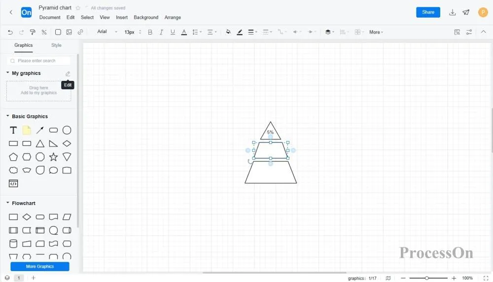
1. To create a pyramid diagram: Open ProcessOn official website, go to the personal file page, and click Create to create a flowchart . Or go to the template community and search for "pyramid diagram" and select a template.
2. Add and modify content: Select a graphic symbol from the symbol library on the left , drag it to the canvas, combine it into a pyramid diagram, and modify the content of the diagram as needed. You can also click [Edit] after My Graphics in the Graphics Library to import local graphics. You can add text labels to mark the representative meaning of each block. The label design should be clear and concise, and the internal and external labels should cooperate with each other to ensure the accuracy and readability of the information.
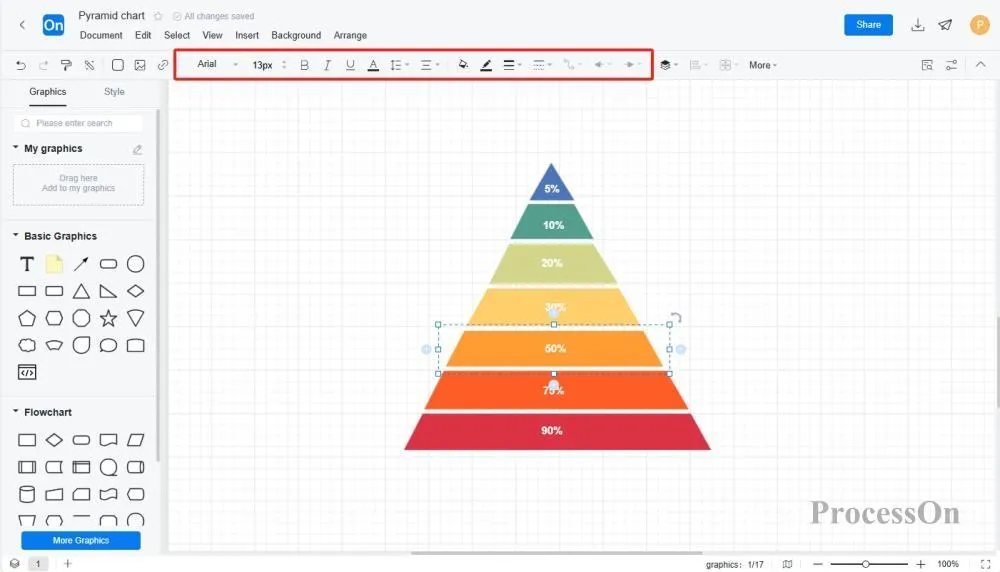
3. Modify style: In the top style toolbar , you can modify the style of the chart, such as color, line, font, etc. The color matching should be reasonable, and different categories of blocks should be distinguished by different colors, while maintaining the harmony and unity of the overall tone.
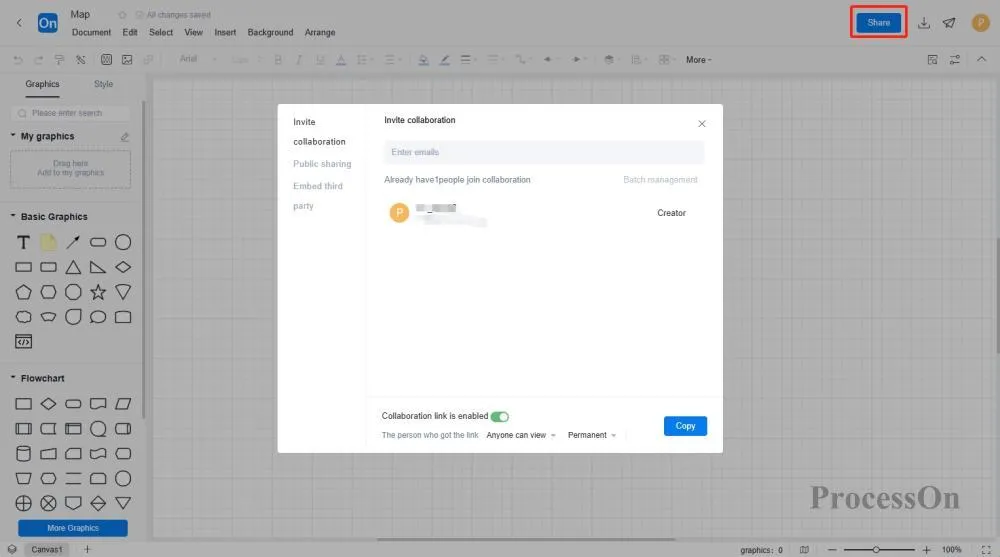
4. Save and export: After drawing, click File-Export to save the chart as a picture, SVG or other formats for use in reports or presentations. You can also click Share to collaborate to generate an online collaboration link for the file and share it with others for joint editing and viewing.
The pyramid chart is not only a type of chart, but also a manifestation of structured thinking. It follows the principle of "generalization first, then division", putting the conclusion at the top and then unfolding the arguments and evidence layer by layer. This structure helps people think and express problems clearly, ensuring the logic and orderliness of information. In work and life, we can use the pyramid structure to organize and manage information and improve the efficiency of thinking and expression.
The ProcessOn template community contains a variety of pyramid diagram templates for reference in multiple industries, and supports cloning to improve drawing efficiency. The following are some templates for sharing.
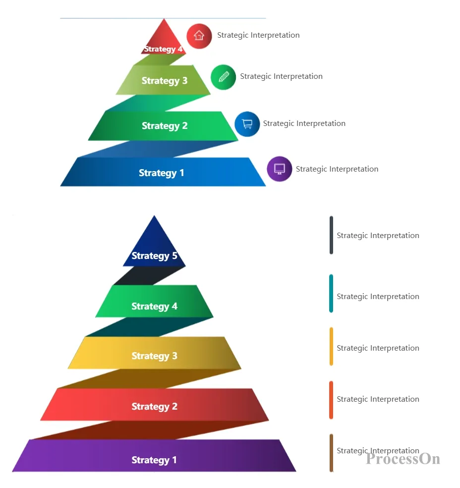
Using the Template - Strategic Pyramid Template
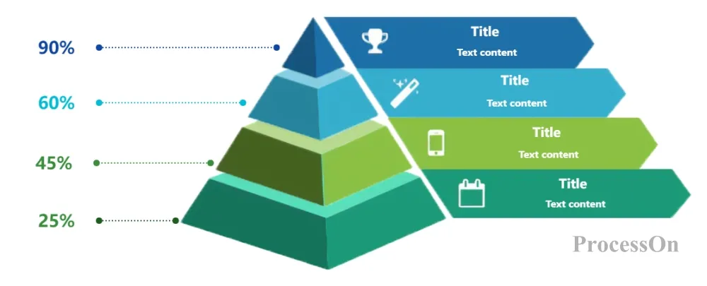
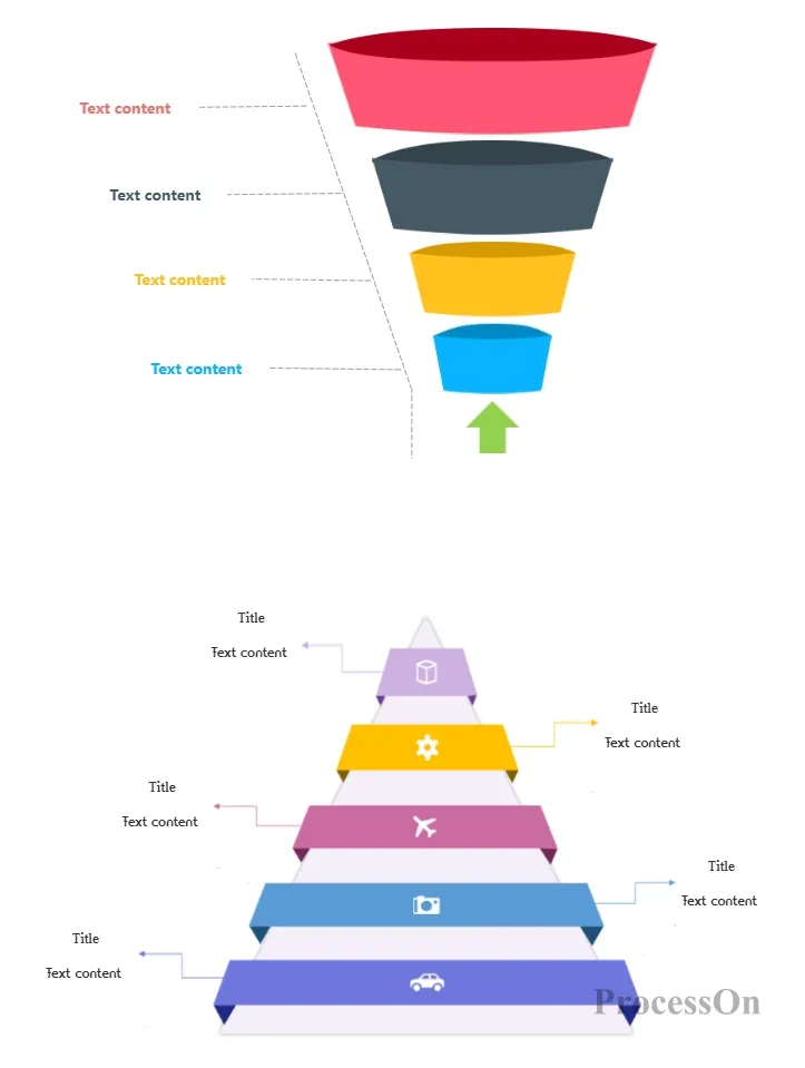
Use Template - Pyramid Chart Template
Use Template - Hierarchical Pyramid Template
In summary, as a type of chart that intuitively displays the relationship between proportions, the pyramid chart has a wide range of application value in data analysis, market research, corporate strategic planning and other fields. By choosing the right drawing tools and mastering the correct drawing methods, we can easily create a beautiful and logical pyramid chart.