Free distribution
Parenthesis Diagram
Radar chart is a type of chart used to display multivariate data . With its unique graphic structure and multidimensional data display capabilities, it helps us understand and analyze complex data. This article will give a comprehensive introduction to radar charts, including its definition, application scenarios, drawing tools, drawing methods , etc.
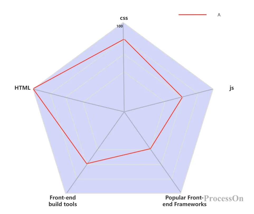
Radar chart, also known as spider chart or polar chart, is a type of chart used to display multivariate data. It uses a central point as a reference point and radiates multiple axes of data series. Each axis represents a variable, and the length and angle of each axis are used to show the distribution and trend of the data. Radar chart can map data of multiple dimensions to coordinate axes. These coordinate axes all start from the same center of the circle and finally return to the circumference to form a closed polygonal area, thereby intuitively reflecting the performance of the object in multiple dimensions.
Radar charts have a wide range of application scenarios, including:
Business decision-making: It plays an important role in market research, competition analysis, brand evaluation, etc. Through radar charts, companies can quickly understand market trends, the strengths and weaknesses of competitors, and their own brand performance, providing strong support for the formulation of marketing strategies and product planning.
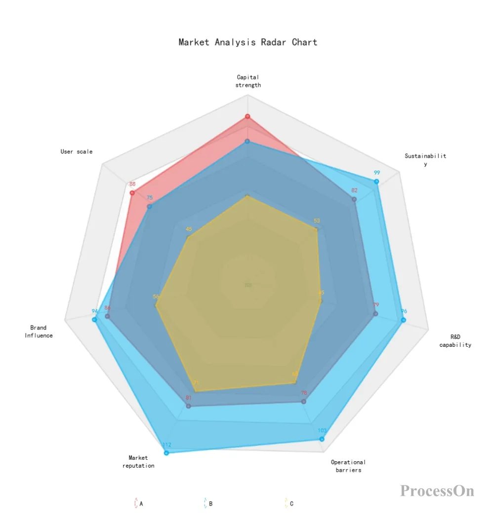
Market Analysis Radar Chart-Go to Edit
Performance evaluation: used to evaluate the performance of individuals or teams in different dimensions, such as sales, market share, customer satisfaction, etc. The radar chart can clearly display the value of each evaluation indicator, making it easier for managers to analyze and improve performance.
Performance Evaluation Radar Chart-Go to Edit
Product feature comparison: Compare the performance of different products or solutions in various features to help consumers or companies make choices. Radar charts can intuitively display the comprehensive performance of products and help consumers fully understand the advantages and disadvantages of products.
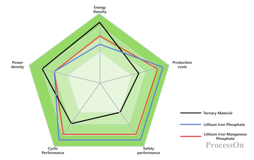
Product characteristics radar chart (positive electrode material)-Go to Edit
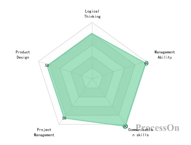
Education and Human Resources: Evaluate students’ academic performance, social practice, innovation ability and other aspects, or applicants’ professional skills, communication skills, leadership ability and other dimensions of ability.
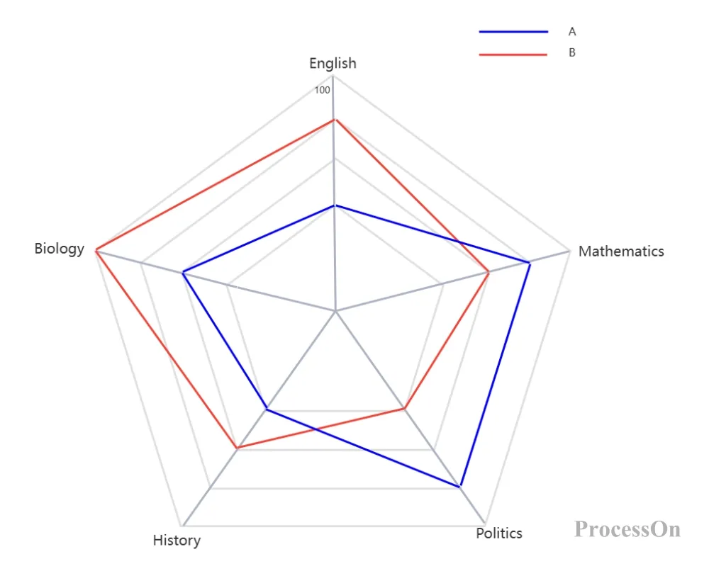
Academic performance radar chart-Go to Edit
In addition, radar charts are also widely used in financial investment, scientific research, environmental monitoring and other fields.
drawing radar charts , including professional drawing software and drawing libraries in programming languages. The following are some commonly used drawing tools:
Excel: Excel is one of the most commonly used office software. Its built-in chart function includes a radar chart option. Users only need to select data and insert a radar chart to quickly generate a chart. Excel also supports formatting of charts, such as color, legend layout, font size, etc.
PowerBI: PowerBI is a business intelligence tool launched by Microsoft. Although radar charts are not included in its visualization chart options by default, users can add radar charts by importing visual objects in AppSource. PowerBI also supports linkage with other charts to provide rich data visualization effects.
ProcessOn : ProcessOn is a flowchart mind mapping drawing tool. Due to the high degree of freedom of the flowchart editor, it can also be used to draw radar charts .
Python: For radar charts that require high customization, Python is a good choice. Drawing libraries such as matplotlib and plotly in Python provide powerful drawing functions, and users can draw radar charts by writing code. In addition, Python can also be integrated with PowerBI, running Python code in PowerBI to draw complex graphics.
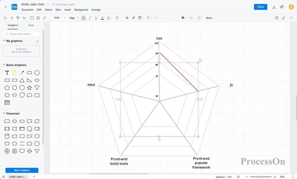
The following is a radar chart drawing method using ProcessOn as an example :
1. To create a radar chart: Open ProcessOn official website, go to the personal file page, and click Create to create a flowchart . Or go to the template community and search for "radar chart" and select a template.
2. Add and modify content: Select a graphic symbol from the symbol library on the left , drag it to the canvas, combine it into a radar chart, and modify the content of the chart as needed. You can also click [Edit] after my graphic in the graphic library to import a local graphic. The shortcut key L can create a connection anywhere on the canvas.
3. Modify style: In the top style toolbar , you can modify the style of the chart, such as color, line, font, etc. The color combination should be reasonable. Comparisons of multiple categories should be distinguished by different lines , while maintaining the harmony and unity of the overall tone.
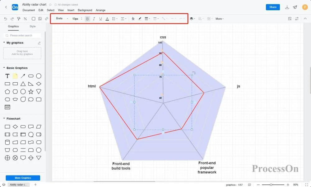
4. Save and export: After drawing, click File-Export to save the radar chart as a picture, SVG or other format for use in reports or presentations. You can also click Share to collaborate to generate an online collaboration link for the file and share it with others for joint editing and viewing.
The analysis and interpretation of radar charts is an important part of data visualization. By observing the shape, area, trend and other characteristics of radar charts, we can explore the meaning and rules behind the data. The following are some common analysis and interpretation methods:
Shape analysis: The shape of the radar chart can reflect the strength and weakness of data points in different variables and their overall balance. If the radar chart tends to be circular, it means that the data points are balanced in all dimensions; if there are obvious sharp corners or depressions, it means that they are outstanding or insufficient in some dimensions.
Area analysis: The area enclosed by the radar chart can represent the overall score or performance of the data point. The larger the area, the better the overall performance of the data point. By comparing the areas of different data points, you can evaluate their relative merits.
Trend analysis: By observing the changing trends of the radar chart at different time points or under different conditions, the dynamic development of data points can be analyzed. This helps predict future trends, develop improvement strategies, etc.
Radar chart is a type of comparison chart . Other comparison charts include line chart, pie chart, bar chart, etc. Compared with these charts, radar chart has its unique advantages :
Strong multi-dimensional display capability: Radar charts can display data of multiple variables at the same time, intuitively reflecting the performance of objects in multiple dimensions. This avoids the tediousness of using multiple single-variable charts and improves the efficiency of data visualization.
Easy to compare: When there are multiple sets of data, by plotting them in the same radar chart, it is easy to compare the differences between different objects in various dimensions. This helps to quickly identify the pros and cons and discover potential problems.
Intuitive graphic shapes convey information: The polygonal shape of the radar chart can intuitively convey the comprehensive characteristics of the object. By observing the shape and area of the radar chart, users can quickly understand the overall performance and relative advantages and disadvantages of the data points.
Of course, radar charts also have certain disadvantages:
Poor readability: When the number of spokes on a radar chart is large, the chart may become too complex, making it difficult for readers to quickly and accurately interpret the information. Overlapping and crossing between spokes may also affect the clarity of the chart.
Difficulty comparing data: Due to the shape and layout of radar charts, it can be difficult to compare different data points, especially those located on different spokes. This can be further complicated when comparisons need to be made between multiple radar charts, as the spoke orientation and length may be different for each chart.
Inaccurate data quantification: Data points on a radar chart are usually represented by the length of the spokes, but the proportional relationship between the length and the data value may not be intuitive. Readers may need additional reference lines or scales to accurately understand the size of the data.
The ProcessOn template community contains a variety of radar chart templates for reference in multiple industries, and supports cloning to improve drawing efficiency. The following are some templates for sharing.
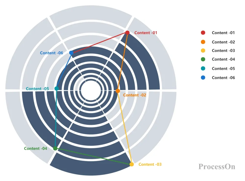
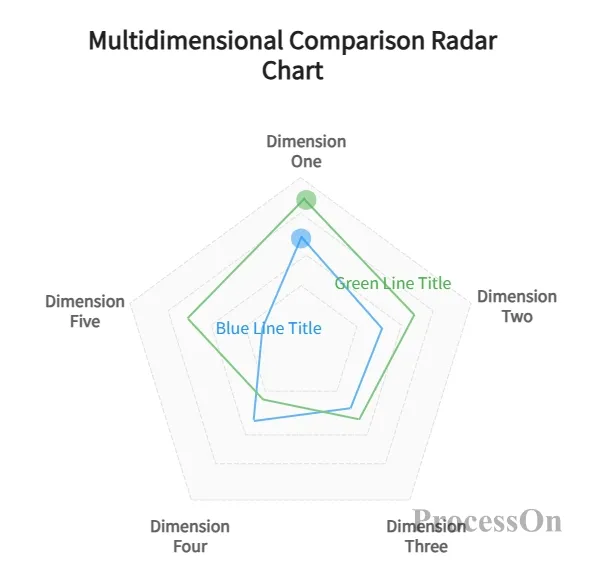
Pentagon chart-multi-dimensional comparison radar chart-Go to Edit
In summary, as one of the important tools in the field of data visualization, radar chart plays an irreplaceable role in many application scenarios with its unique graphic structure and multi-dimensional data display capabilities. By selecting appropriate drawing tools and methods and deeply analyzing and interpreting the characteristics and laws of radar charts, we can better understand and use data and provide strong support for decision-making and improvement.