

A good-looking flowchart can improve readability and portability. Beautiful layout, clear graphics and icons, reasonable color matching and concise text description can make the flowchart easier to read and understand. It helps readers quickly grasp the structure and key points of the entire process and reduce obstacles to understanding. So how to make a good-looking flowchart ? Today, the editor will share with you. For a flowchart, good-looking means clear structure, beautiful layout and comfortable color matching.
A clear structure is the first goal of a flowchart , so the first step is to make it clear who the flowchart is for, and then further determine the specific content and scope of the business process, workflow or data flow that the flowchart is to express, break down the process into specific steps, decision points and information flows, and ensure that each part is clear.
The layout of a flowchart is crucial to improving its readability and aesthetics.
Regarding typesetting , here is some basic typesetting knowledge shared with everyone, which you can refer to. Of course, you can also check out other high-value templates in the ProcessOn template community to improve your aesthetic ability.
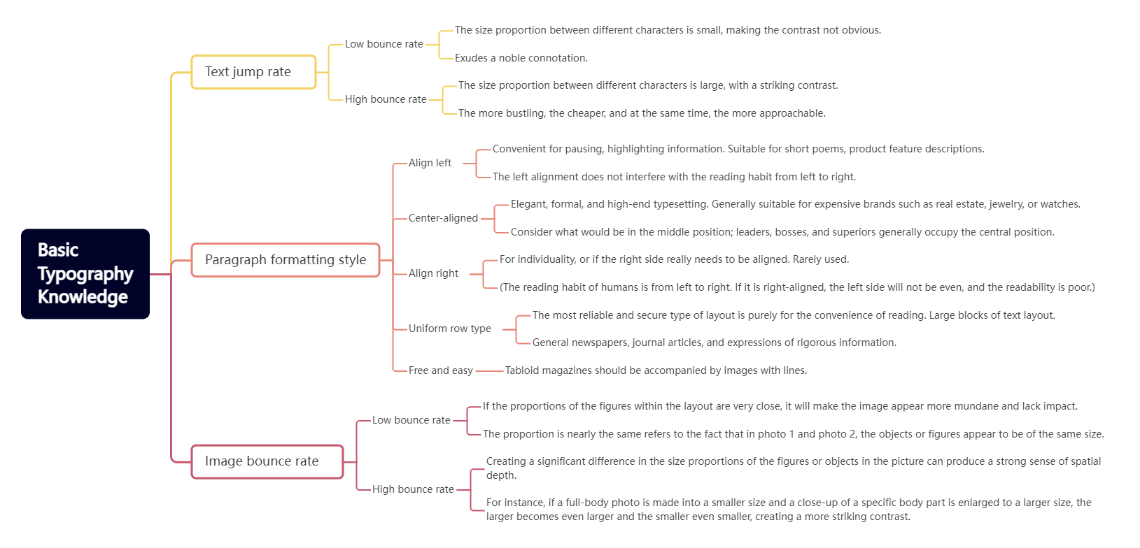
https://www.processon.io/view/network-topology-diagram-structure/66e4074a32f1d95f4bf8cd5e
For flowcharts, there are some other things to pay attention to in terms of layout, including:
1. Determine layout direction
Vertical or horizontal: Choose vertical or horizontal layout according to the content and complexity of the flowchart. Generally, vertical layout is more suitable for expressing the chronological order or hierarchical relationship of the process, while horizontal layout is suitable for showing parallel processes or collaboration between departments.
2. Determine the element position
From top to bottom, from left to right: Follow the reading habit of left to right, top to bottom and arrange the elements of the flowchart in this order. This ensures that readers can follow the development of the process smoothly.
Clear hierarchy: For complex flowcharts, you can add levels to distinguish between the main process and the secondary process. The main process should be located in the center or top level, and the secondary process should be supplemented or branched.
3. Adjust element size and spacing
Consistent size: Try to keep the size of the same type of elements (such as steps, decision points, etc.) consistent to make the overall look harmonious and unified.
Spacing: Adjust the spacing between elements to avoid being too crowded or scattered. Make sure each element has enough space to display its content and connecting lines.
4. Use graphics
Standard graphics: Use standard flowchart graphics (rectangles for steps, diamonds for decision points, etc.) so that readers can quickly identify and understand them.
5. Optimize connection lines
Avoid crossing: Try to keep the connection lines smooth and avoid crossing to improve the readability of the flowchart. If crossing cannot be avoided, you can use line jump marks to distinguish the connection lines of different levels.
Arrows are clearly pointed: Make sure the arrows on the connecting lines are clearly pointed to indicate the direction and sequence of the process.
In addition to typography, there is also color matching. Use appropriate color matching to distinguish different types of elements or emphasize important information. But be careful to avoid using too many colors to avoid visual confusion. There are many things to note about colors. Different genders and different industries need to use matching colors. You can refer to them.
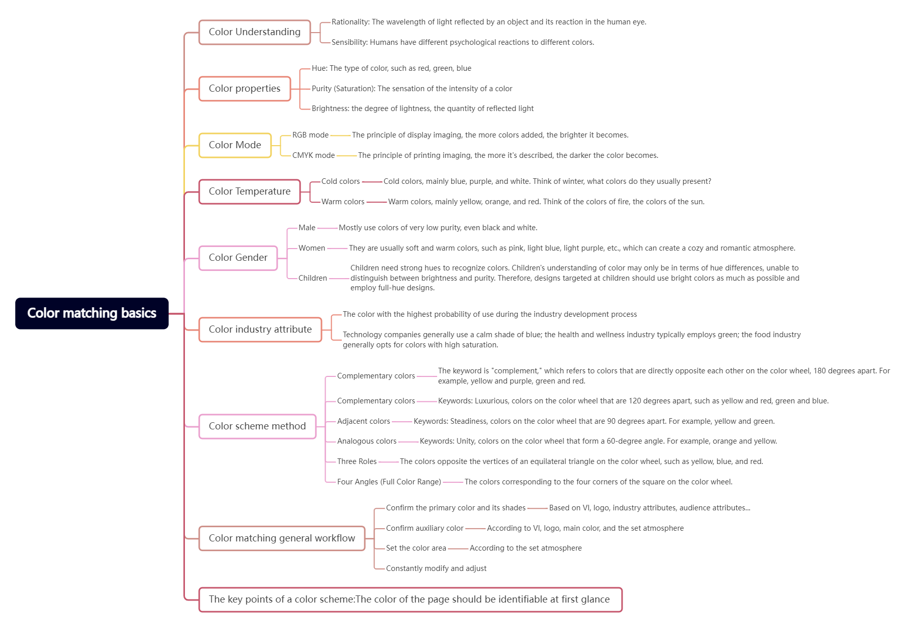

I believe that after reading the above content, you have learned how to make a beautiful and easy-to-understand flowchart through careful typesetting and optimization. Finally, attached are several high-value flowcharts from the ProcessOn template community for your reference.
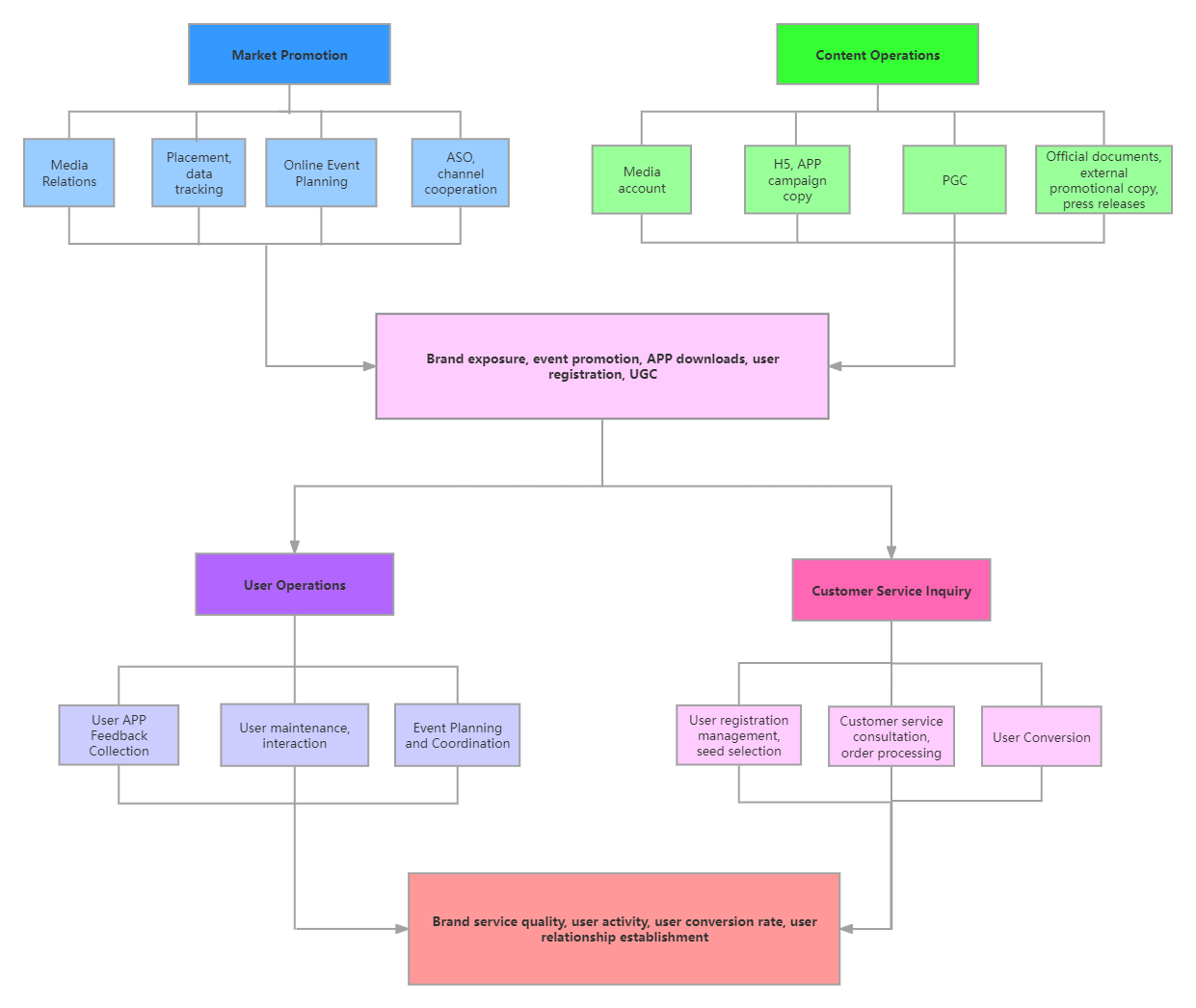
Work organization structure flow chart
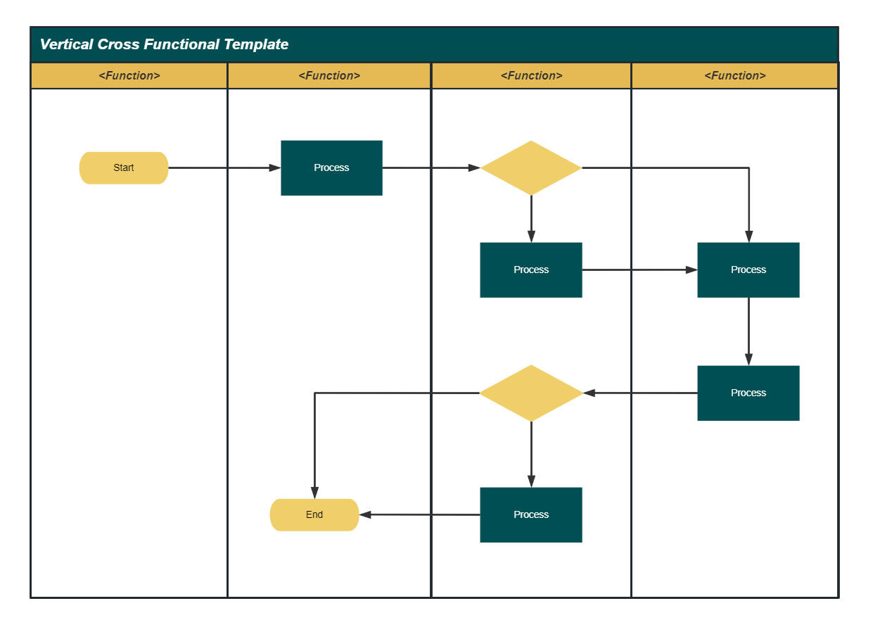
Vertical Swimlane Diagram (Brown Green)
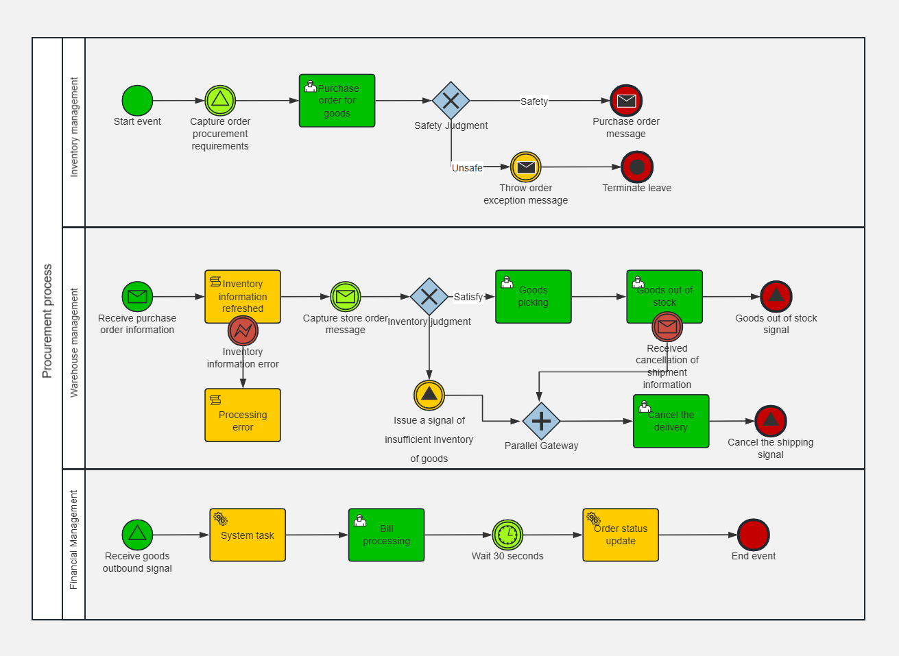
Goods Procurement Process BPMN Use Case Diagram
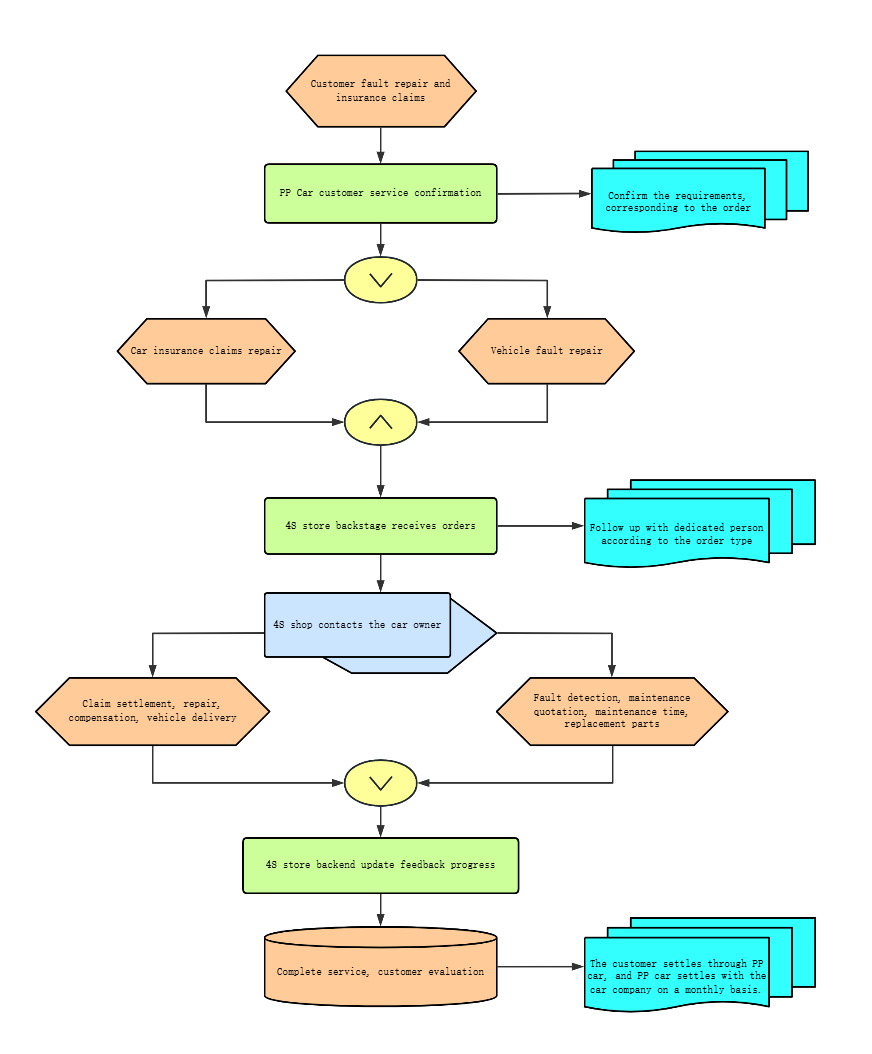
Car Insurance Recommendation Repair Process Flowchart
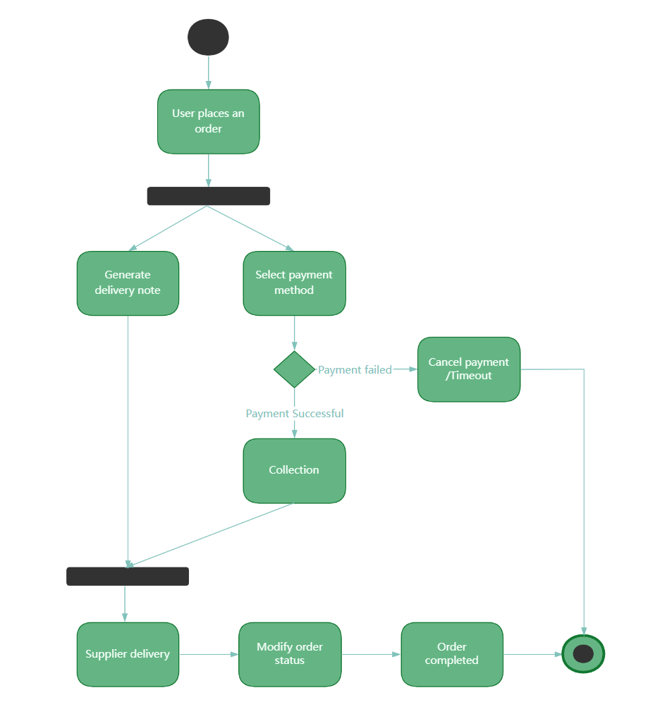
User online shopping process activity diagram
To view more beautiful flowchart templates, please visit the ProcessOn template community .